Bold—Round.
//date: 06.2020
//location: Manchester
01. 04. 15. 13.
Big—Vibrant.
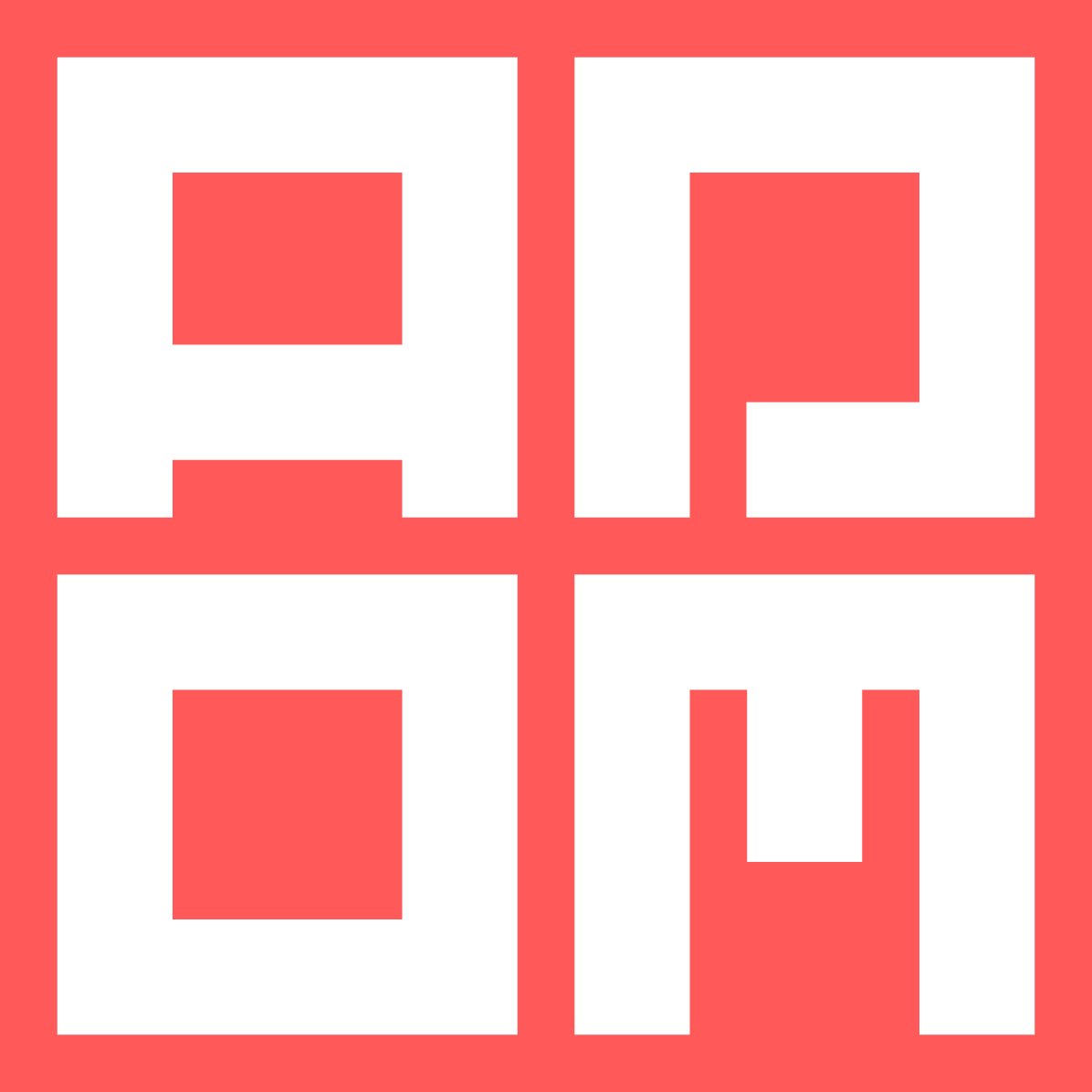
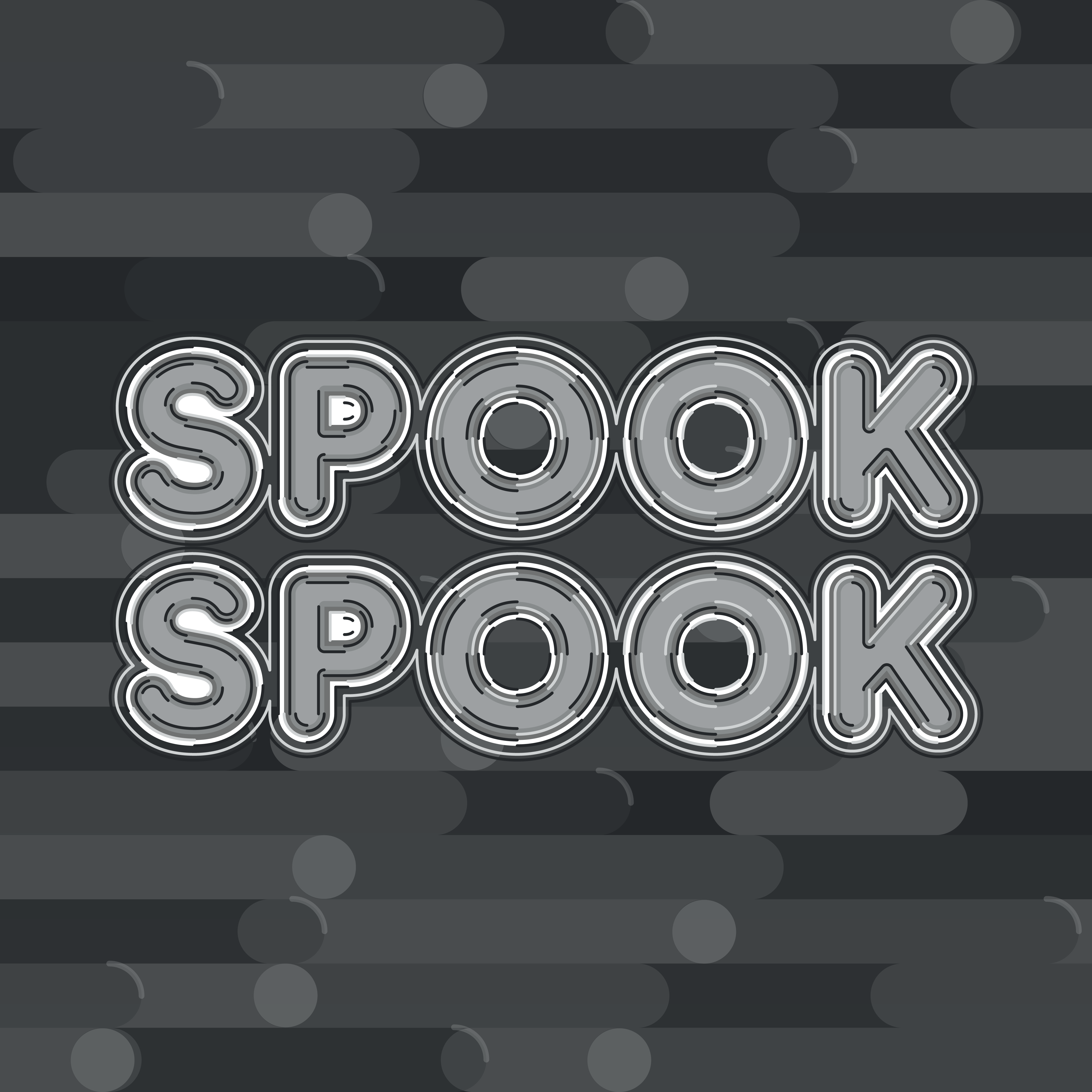
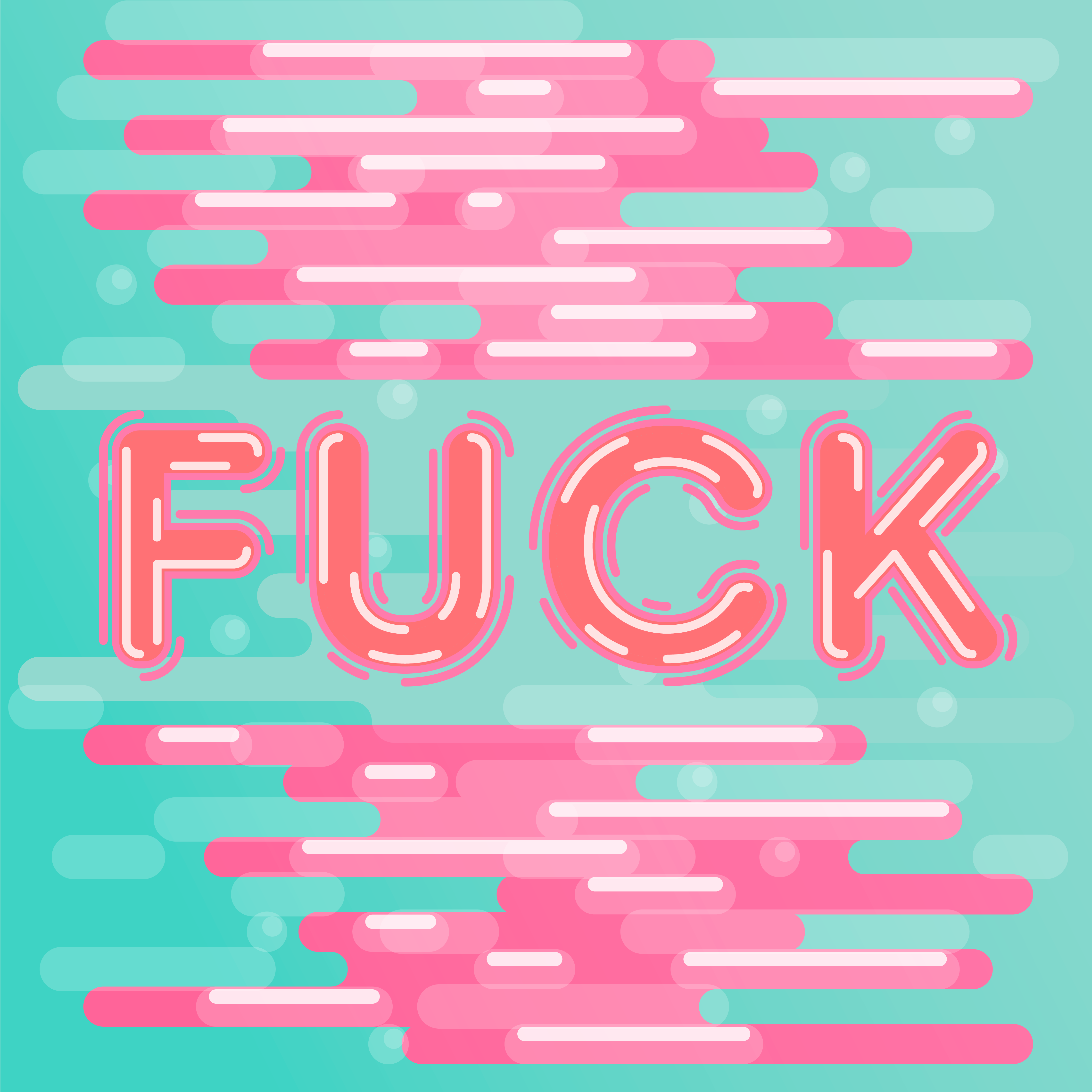
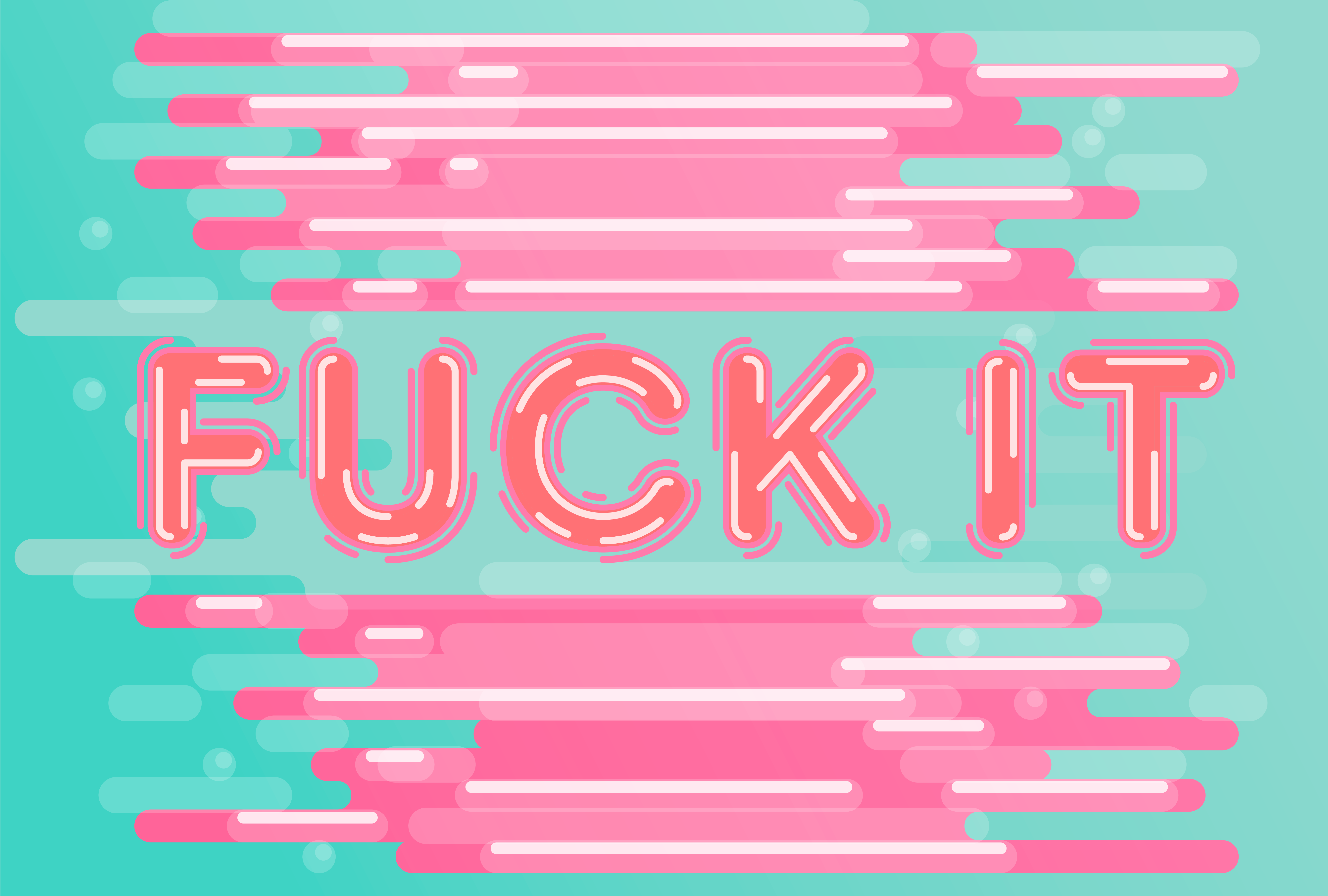
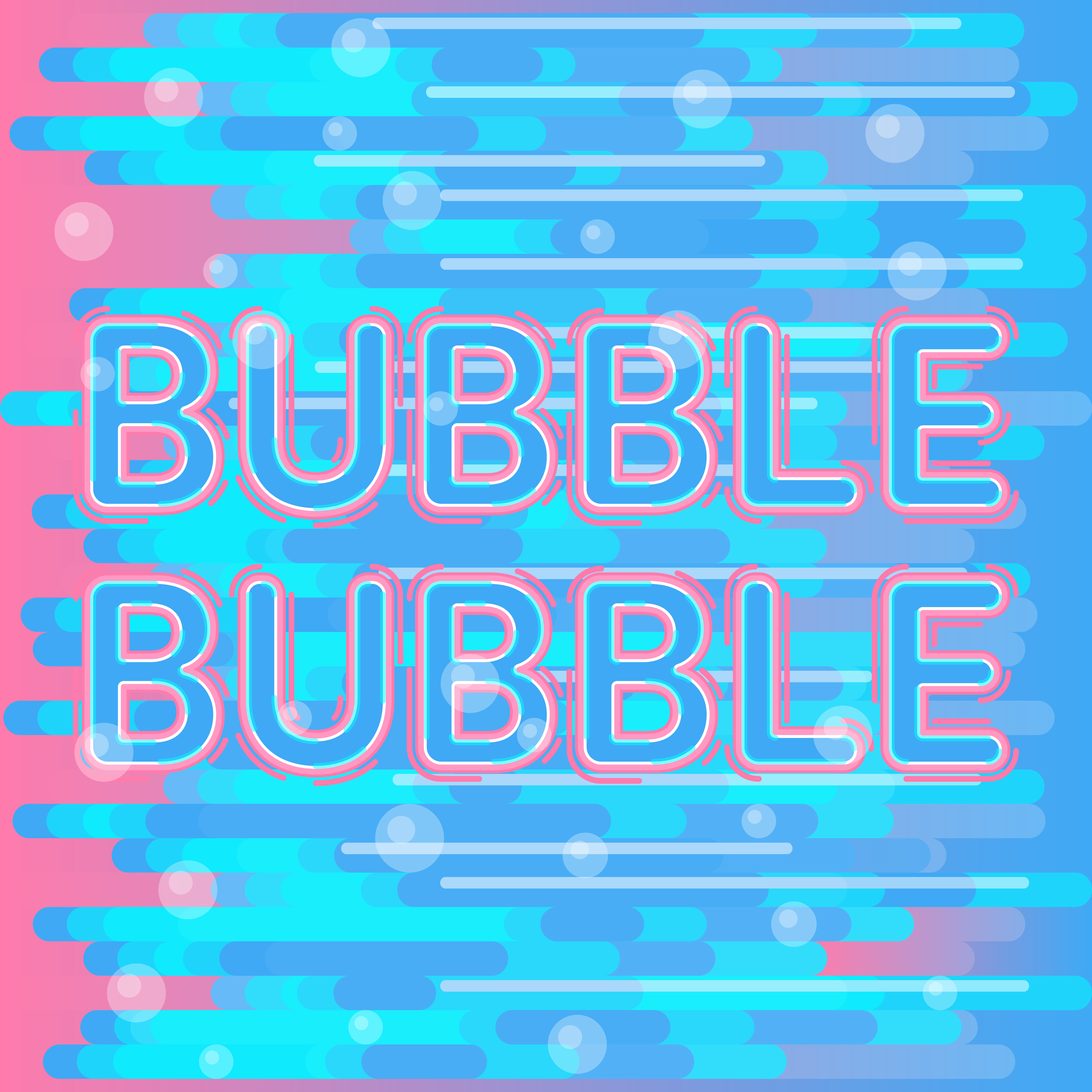
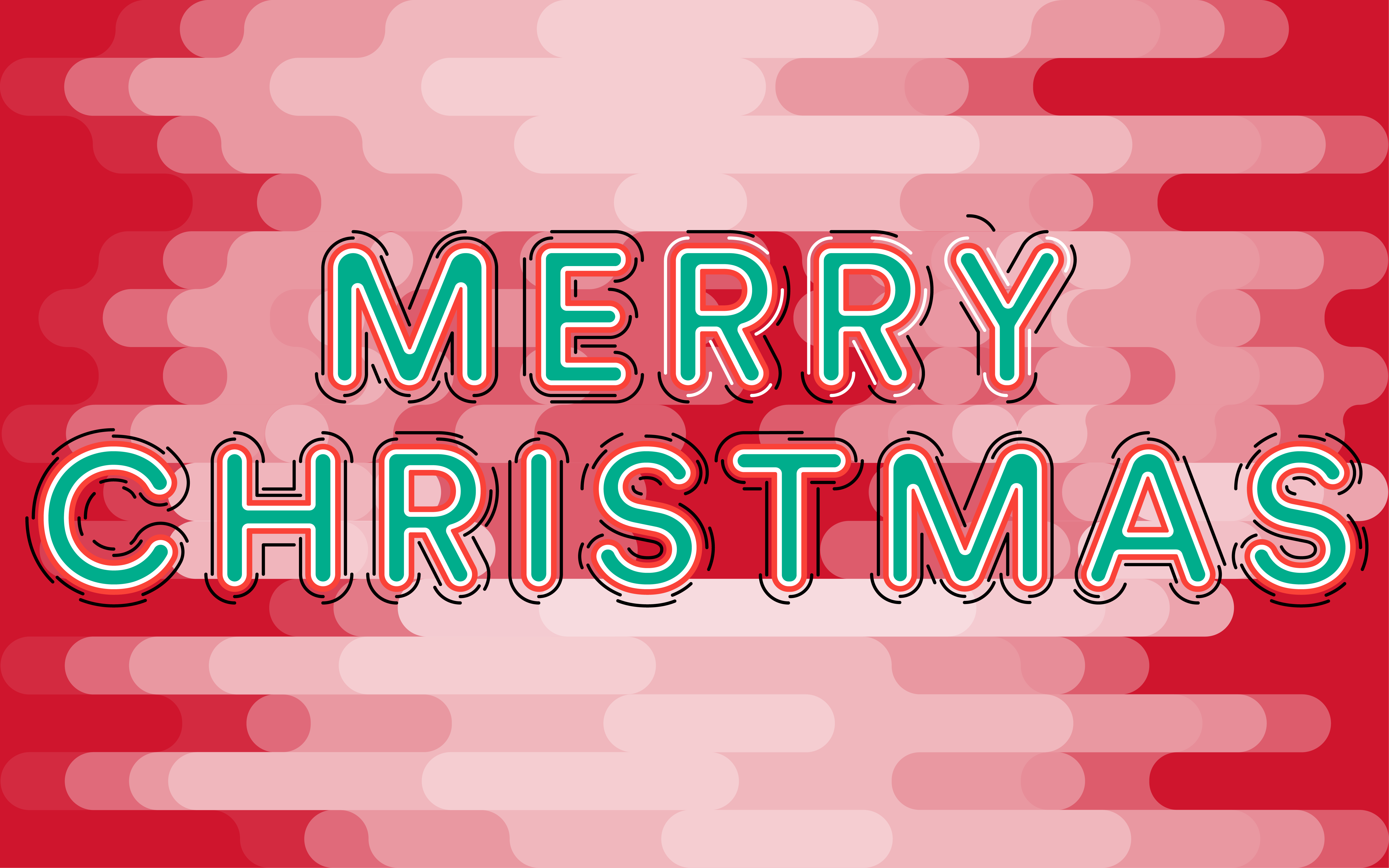
Bold and Round takes a fun spin on typography to show a layered build up of several different basic shapes that can fit together within a background to build depth in perception from a 2D space. Pairing the bright bold colours with the thick weighted line weights that surround the type makes for an easy translation on the eye to make the complexity legible but also intriguing in depth.
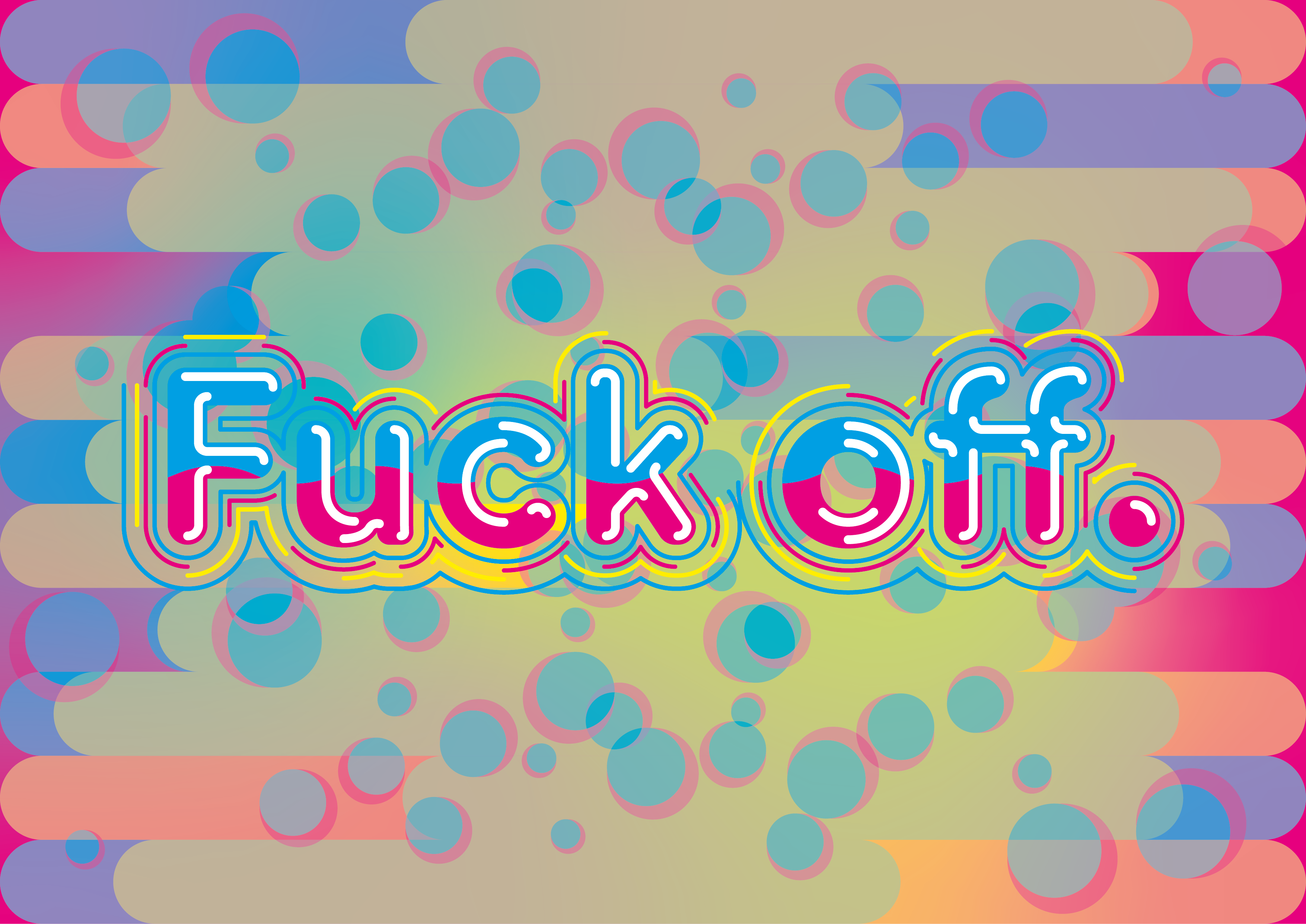
Using different sayings and wording using the playful technique in the design spares the severity of the statement. Using curse words in a joyful way almost strips away the malice behind the wording to read the working at face value as different letters.
Bold and Round takes a fun spin on typography to show a layered build up of several different basic shapes that can fit together within a background to build depth in perception from a 2D space. Pairing the bright bold colours with the thick weighted line weights that surround the type makes for an easy translation on the eye to make the complexity legible but also intriguing in depth.
Using different sayings and wording using the playful technique in the design spares the severity of the statement. Using curse words in a joyful way almost strips away the malice behind the wording to read the working at face value as different letters.
MA.
Adom: (2020) ‘Bold—Round.’ c.05 Adom. Unpublished creative production « Adom »