M.S Awareness Campaign.
//date: 05.2016
//location: Huddersfield
01. 04. 15. 13.
Awareness campaign for multiple sclerosis.
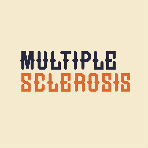
This campaign was created to directly tell the audience exactly what the symptoms are of Multiple Sclerosis. The idea of first creating a typeface that has an additional shape or form within the letter, was a massive factor of the campaign so that it could represent the degenerating signs of the disease from the swelling that can occur in the limbs of MS sufferers.
The GIF element of this campaign allowed a lot of focus to go into each frame so that it could explain the symptoms of MS. Each symptom within the motion graphic tells you what affects you and shows you how it does it using only type. Relating different themes to each symptom helps intrigue those who don’t know what Multiple Sclerosis is and it can give a nice representation for those who suffer with it but can’t visualise exactly what they go through everyday. Individual sections of the GIF show that there is a struggle day in day out with all the various aspects of life, through their mind and body.
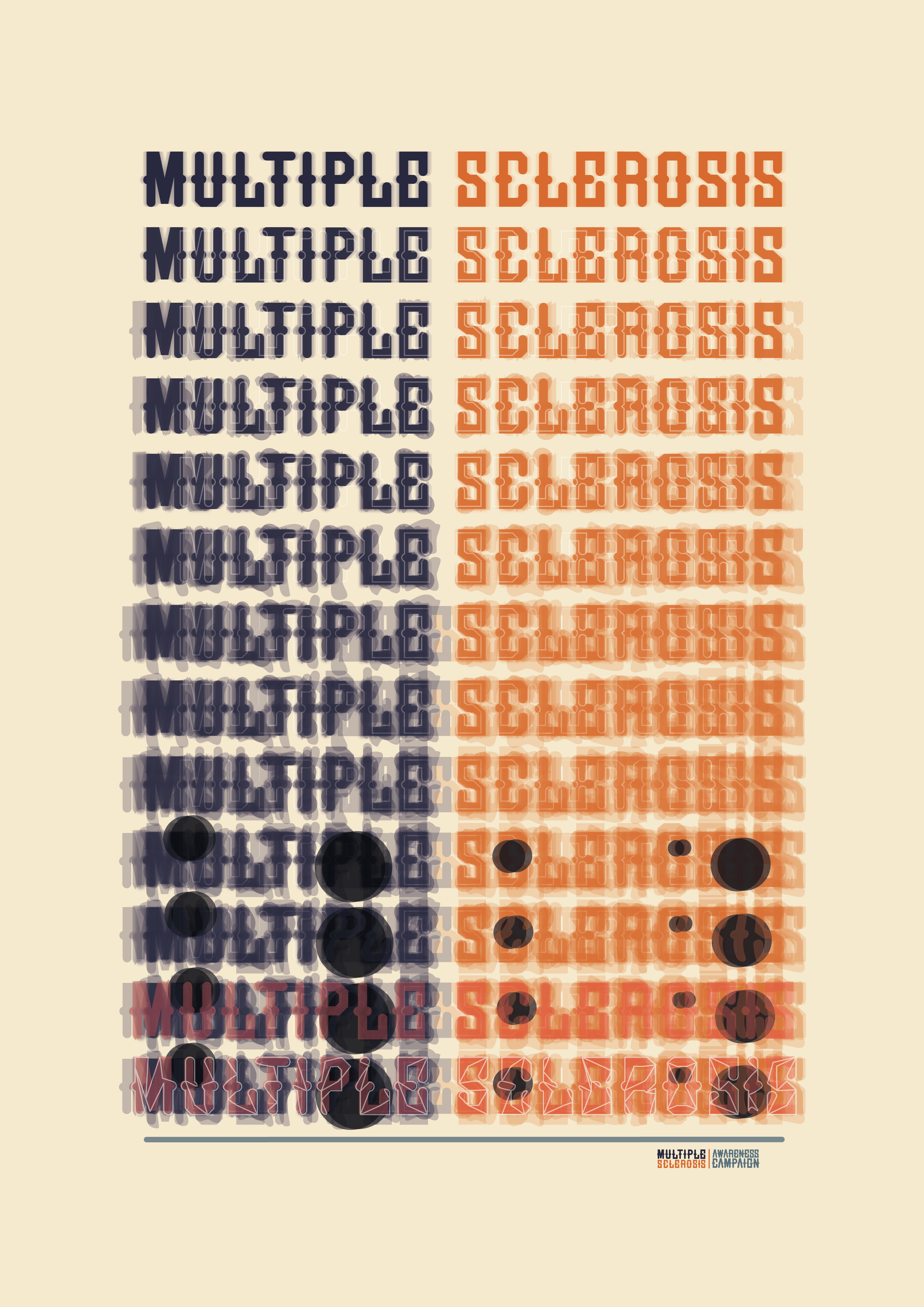
Depicting these in the GIF made it apparent that a poster would go along with it nicely to draw attention in by making it look illegible so they have to look closer into what is going on within the type. Progressively layering each depicted symptom within the type over each other shows the struggle of how they all build up to degenerate the body. The badges that are the final touch point to this campaign will be a way of fundraising for the cause using the same typographical styles shown throughout the campaign.
This campaign was created to directly tell the audience exactly what the symptoms are of Multiple Sclerosis. The idea of first creating a typeface that has an additional shape or form within the letter, was a massive factor of the campaign so that it could represent the degenerating signs of the disease from the swelling that can occur in the limbs of MS sufferers.
The GIF element of this campaign allowed a lot of focus to go into each frame so that it could explain the symptoms of MS. Each symptom within the motion graphic tells you what affects you and shows you how it does it using only type. Relating different themes to each symptom helps intrigue those who don’t know what Multiple Sclerosis is and it can give a nice representation for those who suffer with it but can’t visualise exactly what they go through everyday. Individual sections of the GIF show that there is a struggle day in day out with all the various aspects of life, through their mind and body.
Depicting these in the GIF made it apparent that a poster would go along with it nicely to draw attention in by making it look illegible so they have to look closer into what is going on within the type. Progressively layering each depicted symptom within the type over each other shows the struggle of how they all build up to degenerate the body. The badges that are the final touch point to this campaign will be a way of fundraising for the cause using the same typographical styles shown throughout the campaign.